Affordances
What are scrollbars?
They seem like a fairly complex element made up of many distinct parts, and yet there is no <scrollable> element or <scrollbar> element.
Instead, we make elements scrollable.
Instead, we give elements scrollbars.
Why is that?
Scrollbars as Affordances
What happens when the content is too tall for the screen?
When content is too tall for a window, the window becomes scrollable. And when the window is scrollable, it receives scrollbars.
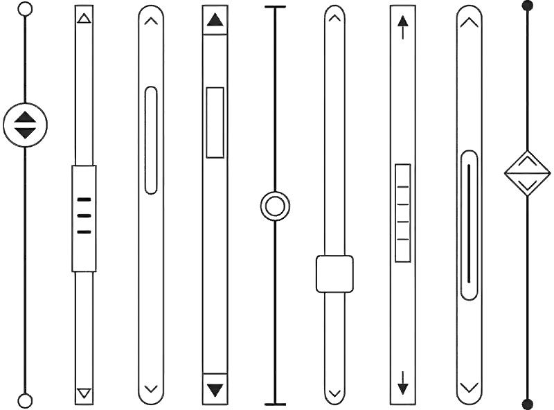
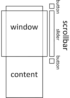
Scrollbars serve two purposes; they communicate position and let users control that position.
Scrollbars communicate where a visible area is positioned within a larger, not fully-visible area. It also communicates overall the size of the content.
Scrollbar sliders control moving through a large area of content with a draggable interface. Scrollbar buttons control moving through the area with a clickable interface.
The current scroll position can be read, watched, and changed from JavaScript.
onscroll = (event) => {
	console.log(event.target.scrollTop)
}

scroll({
	top: 100,
	left: 100,
	behavior: 'smooth'
})
CSS can be used to change how scrollbars appear or whether they appear at all.
html {
	overflow-x: hidden;
	overflow-y: auto;
	scrollbar-color: blue white;
	scrollbar-width: thin;

	::-webkit-scrollbar {
		background-color: white;
	}

	::-webkit-scrollbar-thumb {
		background: blue;
	}
}
In every way, scrollbars is like any other HTML element. They have an interface. They have an API. They can be styled.
So then why isn’t every scrollbar written out as an element? Here is the key difference between something like a scrollbar and any regular element:
- It is not content.
- It is a way to experience content.
A scrollbar is an affordance.
“the quality or property of an object that defines its possible uses or makes clear how it can or should be used”
An affordance is something that makes it clearer how to do something.
Specifically on the web, affordances let us present regular content with different ways to consume it.
If we better understand affordances, then I think we can build better experiences for our users.
Disclosure Menus as Affordances
What happens when the main menu is too wide for the screen?
For narrower screens, websites sometimes use ’disclosures’ (often called ‘hamburgers’) to present important links or controls.
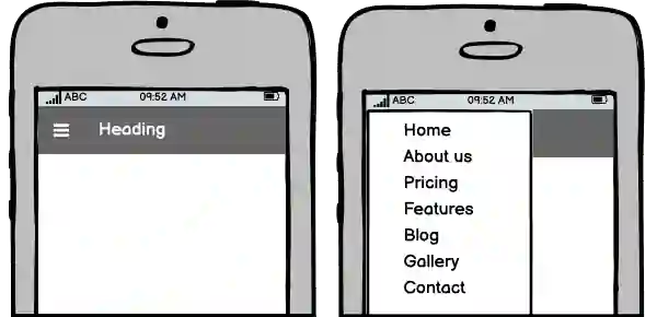
Like scrollbars, disclosures are an affordance.
Disclosures communicate whether and how important items are accessed. Disclosures let the user control whether those items are shown or hidden.
- When the disclosure button is clicked, the items are shown.
- When the button is clicked again, the items are hidden.
Unlike scrollbars, this affordance isn’t built in, and so authors need to create it themselves. This is often accomplished by adding additional elements to the page.
<!-- disclosure affordance -->
<input id="hamburger" type="checkbox" />
<!-- or <button aria-pressed> -->
<!-- or, or, or... -->

<!-- important links or controls -->
<nav>
	<ul>
		<li>
			<a href="/">Home</a>
		</li>
		<li>
			<a href="/about/">About Us</a>
		</li>
		<li>
			<a href="/pricing/">Pricing</a>
		</li>
	</ul>
</nav>
And, like scrollbars, CSS can be used to change whether and how they appear.
#hamburger {
	@media (width < 700px) {
		+ nav {
			overflow: hidden;
		}

		&:checked + nav {
			max-height: 100vh;
		}

		&:not(:checked) + nav {
			max-height: 0vh;
		}
	}

	@media (width >= 700px) {
		display: none;
	}
}
If we designed this affordance to behave like it were builtin, I think it might look something like this:
@media (width < 700px) {
	nav {
		is: disclosure-navigation;
		max-height: 100vh;

		::disclosure-button {
			/* styles for the disclosure button */
		}
	}
}
Tabsets as Affordances
What happens when all the related sections don’t fit on the screen?
Websites can use ‘tab’ panels to organize large sets of options or content into independent views.
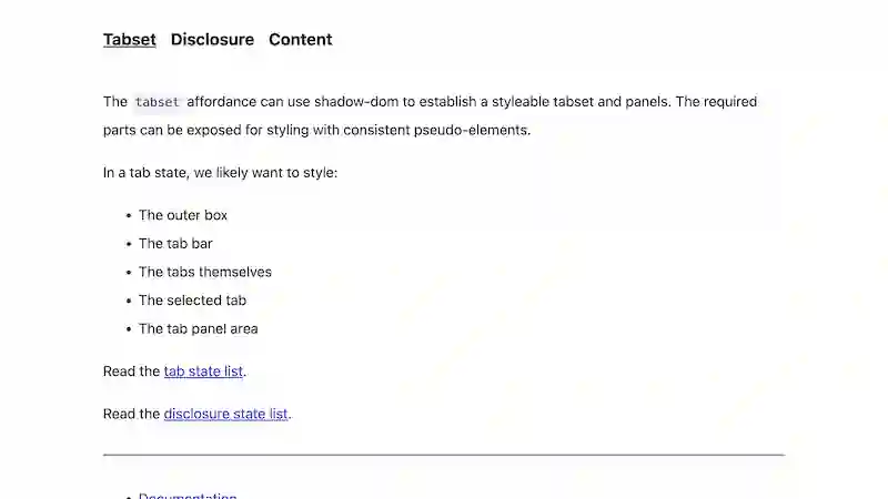
Tabset headings are displayed in sequential order to communicate the headings for each panel. The headings also double as buttons used to control which panel is displayed.
Tabset affordances aren’t built in, either, and so authors need to create it themselves. This is often accomplished by adding additional elements to the page like this:
<section class="set">
	<nav>
		<a href="#ingredients">
			Ingredients
		</a>
		<a href="#directions">
			Directions
		</a>
		<a href="#nutrition">
			Nutrition
		</a>
	</nav>

	<div id="ingredients">
		<p>5 tablespoons chocolate...</p>
	</div>

	<div id="directions">
		<p>Combine milk, honey, and...</p>
	</div>

	<div id="nutrition">
		<p>110 calories, 6 grams of fat...</p>
	</div>
</section>
But wait a minute…
This doesn’t make sense as regular content.
We have sections without headings, and we have headings without sections.
If affordances are only a way to experience content, then let’s redesign our tabset affordance to work with regular content like this:
<section class="set">
	<h3>Ingredients</h3>
	<p>5 tablespoons chocolate...</p>

	<h3>Recipe</h3>
	<p>Combine milk, honey, and...</p>

	<h3>Nutrition</h3>
	<p>110 calories, 6 grams of fat...</p>
</section>
This markup is better organized and easier to read.
To display the headings in sequential order, we can use Custom Elements and the ShadowDOM.
But just one more thing…
Like disclosure menus, we can also rearrange the these panels into disclosures (like ‘accordions’) on narrower screens.
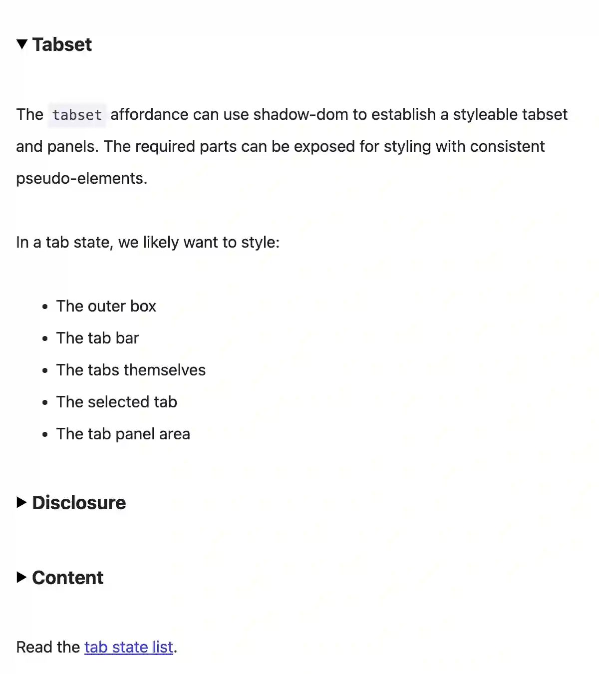
It would have been much harder to switch the affordance on these sections from tabs to disclosures if we had hard-coded tabs into our regular content.
And finally, if we designed this affordance to behave like it were builtin, I think it might look something like this:
.set {
	@media (width < 700px) {
		is: disclosures;
	}

	@media (width >= 700px) {
		is: tabs;
	}
}